
Benefits of 3D Sign Textures: How 3D Textures Enhance Your Sign
Introduction
Flat signs work. But if you want your work to feel higher-end (and price higher), 3D textures are one of the fastest upgrades you can make.
This guide is for CNC sign makers and anyone building carved signage who wants better depth, better photos, and fewer “why did this carve like that?” moments.
In this guide:
What 3D sign textures are and where they fit in a CNC workflow
The real benefits: depth, contrast, speed, and pricing power
Common carve problems and the quick fixes
A simple step-by-step workflow (HDU, wood, foam)
How to spot a high-quality texture STL before you buy or cut

What are 3D Sign Textures?
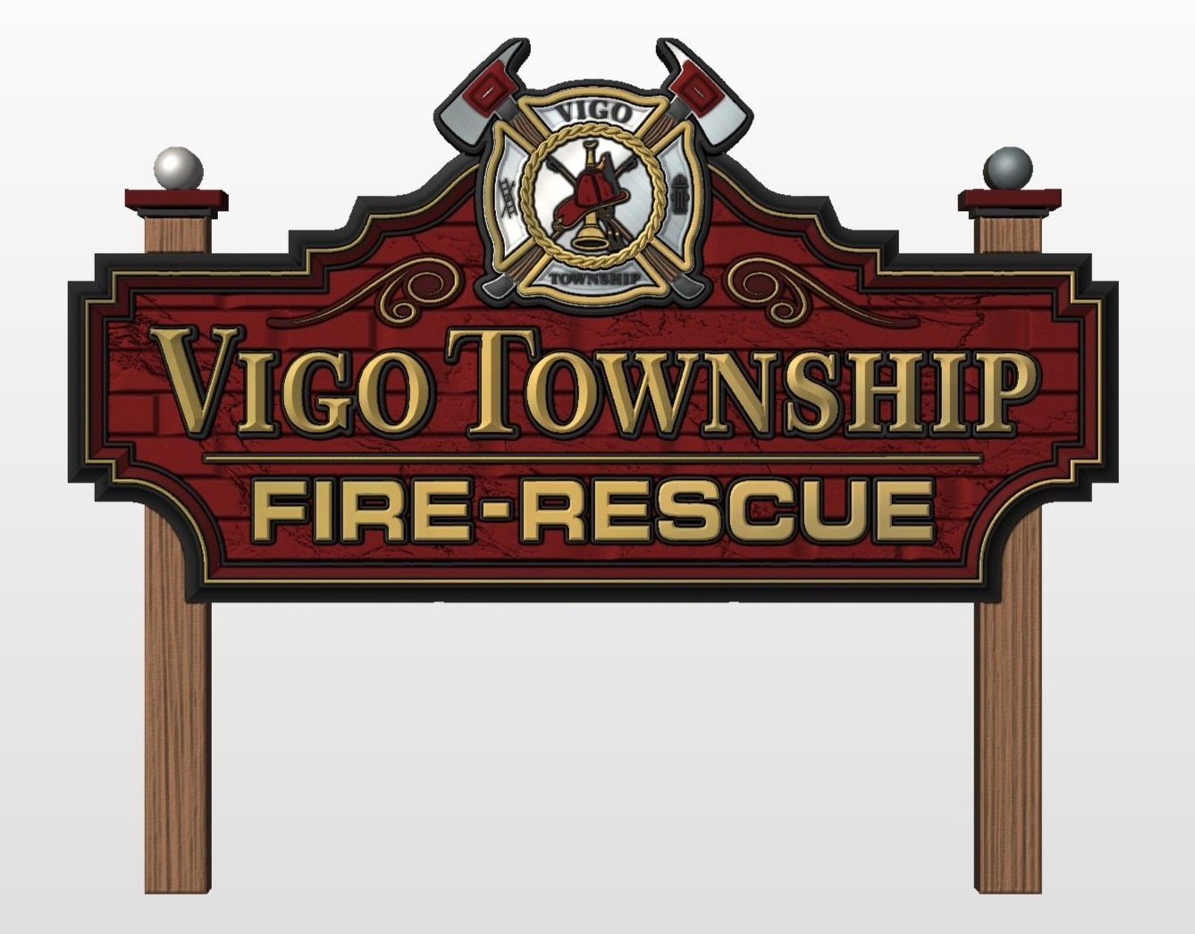
A 3D sign texture is a carved surface pattern that adds depth to a sign, usually as a background behind lettering, logos, or raised elements.
Instead of leaving a backer perfectly flat, you carve a controlled relief pattern like:
woodgrain, stone, concrete, hammered metal
waves, topographic lines, geometric patterns
subtle “fabric” textures or stylized repeats
Textures can cover an entire backer, sit inside a frame, or fill just a portion of a layout to keep the design from feeling empty.
Why 3D textures make signs look better (and sell better)
Depth creates instant “premium”
Even a shallow relief adds shadow and highlight. That contrast makes the sign read as more dimensional from a distance and more detailed up close.
Better readability around logos and lettering
A well-chosen texture can separate the background from raised letters, prismatic elements, or a logo plaque, especially after paint.
The key is picking a texture that supports the focal point instead of fighting it.
More visual interest without clutter
Textures add complexity without adding more shapes, more clipart, or more “stuff” in the layout. You keep the design clean, but it stops feeling empty.
A faster path to “custom-looking”
You can produce a unique result quickly by combining:
one good texture
a clean logo treatment
a simple border or backplate
That combination often looks more custom than spending hours tweaking small layout details.
Pricing power and upsells
Textures are a great value add:
“Standard flat backer” vs “textured carved backer”
“Smooth background” vs “weathered woodgrain” or “stone relief”
It gives you an easy way to raise ticket size without changing the whole project.

CNC sign maker practical: what matters when carving textures
A texture looks great in a preview, but in the shop, these details matter more than the sales copy.
Relief depth
Shallow relief often looks cleaner and paints easier.
Deep relief can look amazing, but it increases carve time and finishing time.
A good texture gives you a usable depth range, not just one extreme.
Bit choice and stepover
Larger ballnose bits get you through faster but can leave visible scallops.
Smaller ballnose bits capture detail but increase toolpath time.
If the texture is too “micro-detailed,” you’ll either lose detail with a bigger bit or spend forever with a tiny one.
File density
If a texture is unnecessarily heavy, it can:
slow down your CAM software
increase toolpath calculation time
make previews laggy
create longer, less efficient toolpaths
Good CNC textures balance detail with usability.

Material differences (HDU vs wood vs foam)
HDU: holds detail nicely, finishes clean, predictable carving
Wood: grain can fight fine details, needs smart depth choices
Foam: can carve quickly, but fragile detail needs careful finishing
Textures should be chosen with the material in mind, not just the look.
Common problems + fixes (the stuff that wastes your time)
1) The texture looks “busy” behind the logo
Fix: Reduce relief depth, scale the texture up (bigger pattern), or use the texture only in a border/field instead of the full backer.
2) Visible lines or “banding” in the carve
Fix: Adjust stepover smaller, use a sharper finishing bit, or choose a texture designed to carve clean at realistic stepovers.
3) The carve takes forever
Fix: Use a smart roughing pass, then finish with a bit size that matches the texture detail. If the file is too dense for the result, switch textures.
4) The texture tiles, but the seams show
Fix: Confirm it’s truly seamless, then check scale. Seams often show when the texture is too small and repeats too many times.
5) Paint and finish looks muddy
Fix: Choose a texture with clearer “highs and lows,” keep relief depth moderate, and plan your finishing steps (prime, sand, paint) around the texture, not against it.
6) Detail breaks or fuzzes out in wood
Fix: Use slightly larger-scale textures for wood, reduce overly fine detail, and make sure your finishing bit and feeds are realistic for the material.

Step-by-step: how to add a 3D texture to a carved sign
Pick the role of the texture
Full background, framed panel, or small accent area
Choose the right scale
Bigger signs usually look better with a larger texture pattern
Small patterns repeated too much can look like noise
Set relief depth based on material and finish
Shallow for cleaner paint and faster production
Deeper for dramatic shadow, but accept extra time
Rough first, finish second
Roughing removes bulk fast
Finishing captures the texture cleanly
Preview for problem areas
Look for steep walls, tiny ridges, and overly fine detail
Those are your time and sanding traps
Test a corner if it’s a new texture
A small test carve is faster than redoing a full panel

What quality looks like in a 3D texture STL
Use this checklist when you’re choosing textures for real production work.
CNC-friendly detail: looks good with realistic bit sizes and stepovers
Reasonable file weight: doesn’t bog down import, preview, or toolpath calc
Clean relief shapes: no weird spikes, thin fragile peaks, or “mushy” flats
Seamless means seamless: tiles without obvious seams when scaled properly
Useful depth range: you can run it subtle or bold without the file falling apart
Clear description: tells you native size, tiling behavior, and intended use
Consistent results: the texture carves the way it looks in the preview
FAQs (Frequently Asked Questions)
Are 3D textures only for big signs?
No. They work on small signs too. You just need the texture pattern scaled appropriately so it doesn’t look noisy or over-detailed.
Do textures always increase carve time?
Usually, yes, but not always by a lot. Smart roughing + a CNC-friendly texture can add a premium look without doubling production time.
What’s the best material for textured sign backers?
HDU is the most predictable for crisp relief and easy finishing. Wood and foam can look great too, but they need more careful depth and finishing choices.
How deep should a texture be?
Deep enough to create shadow and contrast, not so deep that it becomes a sanding and paint nightmare. Shallow relief often looks better after finishing than people expect.
Why do some texture files make my software lag?
Many textures are exported with more mesh detail than CNC carving needs. A high-quality CNC texture keeps detail where it matters and stays workable.
What does “seamless” actually mean?
It means the edges of the texture match up when repeated so you don’t see a seam line. Scale still matters because tiny repeats can look obvious even if the file is seamless.
Can I use a 3D texture behind raised letters?
Yes, and it’s one of the best uses. Just make sure the texture supports readability. Often that means reducing depth or scaling the texture larger.
How do I avoid a texture overpowering the logo?
Use a larger pattern scale, lower relief depth, or contain the texture inside a framed field instead of filling the whole backer.
Conclusion
3D textures are one of the easiest ways to make a carved sign feel higher-end without redesigning the entire project. The biggest wins come from choosing the right scale, using a realistic relief depth, and picking CNC-ready files that carve cleanly with normal bit sizes and stepovers.
If you treat textures like a production tool, not just a visual effect, you’ll get better results faster and you’ll have an easy upgrade you can sell on almost every sign.
* Explore 3D texture files for CNC sign backgrounds
* Need a texture built for a specific brand look? Request a custom texture model